
To avoid clipped highlights in neon and laser displays, focus on balancing saturation and brightness carefully. Use color theory to mix primary colors precisely, ensuring vivid hues without overloading intensity. Gradually adjust hue and saturation to keep tones vibrant yet controlled, preventing harsh or washed-out areas. Monitor contrast ratios and calibrate your system regularly to maintain detail in bright spots. Mastering these principles helps you create eye-catching effects without sacrificing clarity—continue exploring these concepts to enhance your visual mastery.
Key Takeaways
- Balance saturation levels to maintain vibrancy without causing excessive brightness or washed-out highlights.
- Gradually adjust hue and intensity to prevent sudden jumps that lead to clipped bright spots.
- Use proper calibration tools to ensure accurate color mixing and consistent brightness control.
- Monitor contrast ratios, especially in varied lighting, to avoid overexposure in bright areas.
- Incorporate softer color transitions and avoid overly saturated colors in highlights for smooth visual effects.
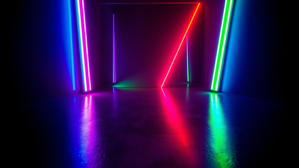
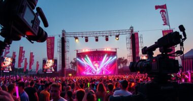
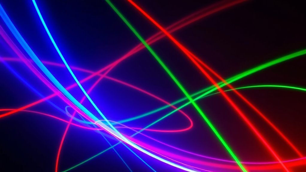
Understanding color theory is vital when working with neon signs and laser displays, as it helps you create vibrant, eye-catching effects. When you’re designing with these mediums, mastering color mixing is key to achieving the desired visual impact. Color mixing involves combining primary colors—such as red, green, and blue—to produce secondary colors and a broad spectrum of hues. By understanding how different colors blend, you can effectively tailor the brightness and tone of your display. For example, blending red and blue yields purple, but the resulting saturation levels depend heavily on the intensity of each color used. If one color’s saturation is low, the final hue might appear dull or washed out, diminishing its visual appeal. Conversely, maximizing saturation levels can make your colors pop, ensuring your neon signs or laser visuals are vibrant and engaging.
Managing saturation levels is vital for avoiding common pitfalls like clipped highlights, where colors become overly bright or lose detail due to excessive intensity. When working with neon and laser visuals, you should aim for a balanced saturation that enhances vividness without pushing the colors beyond their limits. Over-saturating can lead to clipped highlights, where bright areas lose detail and appear as pure white or overly intense spots, distracting viewers and reducing the overall quality. To prevent this, carefully calibrate your color mixing process, gradually adjusting the intensity of each hue until you reach a harmonious saturation level. This control allows you to produce displays that are both luminous and detailed, avoiding the harshness or flattening effects of overly bright highlights.
In practice, understanding the relationship between color mixing and saturation levels enables you to manipulate the visual hierarchy of your display. Bright, highly saturated colors draw attention and create focal points, while less saturated hues can serve as background or supporting tones. This balance ensures your neon signs and laser visuals are dynamic and engaging without overwhelming the viewer. Additionally, being aware of how saturation affects the perception of depth can help you craft more three-dimensional and realistic effects. When you fine-tune your color mixing and saturation levels, you avoid the risk of clipped highlights, preserving the richness and clarity of your visuals. Ultimately, a nuanced grasp of these concepts empowers you to produce professional-quality, eye-catching displays that captivate audiences and stand out in any environment.
Furthermore, understanding the contrast ratio of your projectors can help you achieve better control over how your colors appear in different lighting conditions, ensuring your neon and laser effects remain vivid and precise.
Frequently Asked Questions
How Does Ambient Lighting Affect Neon and Laser Color Perception?
Ambient lighting substantially influences how you perceive neon and laser colors. When ambient light is bright, it can wash out colors, reducing their saturation and making neon and laser hues appear duller. Conversely, dim lighting enhances color saturation, making these vibrant colors pop more vividly. You should consider controlling ambient light levels to optimize the perception of neon and laser colors, ensuring their brilliance is fully appreciated without clipped highlights or washed-out effects.
What Are the Best Tools for Predicting Highlight Clipping?
You can use highlight clipping detection tools in your editing software to predict potential clipping issues. Preview tools, like waveform monitors and histograms, help you visualize where highlights might clip before finalizing your shot. These tools allow you to adjust exposure and contrast in real-time, ensuring your neon and laser colors stay vibrant without losing detail in the brightest areas. Regularly checking these previews keeps your highlights balanced and well-preserved.
Can Post-Processing Fix Clipped Highlights in Neon Photography?
Clipped highlights in neon photography can feel like a nightmare, but yes, post-processing can help with highlight recovery. You’ll want to use advanced tools for exposure adjustments to bring back detail in the brightest areas. While it’s not always perfect, these techniques can salvage some of the lost glow, making your neon images pop without losing their vibrant essence. Don’t give up—your dazzling shots can still shine through post-processing!
How Do Color Temperature Variations Influence Laser Color Accuracy?
You should focus on how color temperature variations impact laser color accuracy by ensuring proper laser calibration. When your laser’s color temperature shifts, it can cause color discrepancies, making your laser output appear inaccurate. Regular calibration aligns the laser’s color temperature with your desired settings, maintaining consistent and true colors. By controlling these variations, you’ll achieve more precise, vibrant laser effects, avoiding unwanted color distortions and ensuring your project looks exactly as intended.
Are There Specific Color Combinations to Avoid in Neon Signage?
Ever wonder which neon color combos to avoid? You should steer clear of pairing highly saturated colors with complementary contrasts that clash, like bright red with green or yellow with purple. These combinations can create visual tension, making your signage harder to read and less appealing. Instead, aim for balanced color saturation and harmonious contrasts to guarantee your neon remains vibrant, eye-catching, and easy to see.
Conclusion
Think of neon and lasers as vibrant flames, bright but delicate. By mastering color harmony and avoiding clipped highlights, you keep that fire alive—glowing without burning out. When you balance intensity with subtlety, you preserve the flame’s energy, symbolizing clarity and precision. Remember, your colors are like sparks—powerful yet fragile. Handle them with care, and your visuals will shine brilliantly, capturing attention without losing their spark in the darkness.