
To avoid clipped highlights in neon and laser displays, you should balance color saturation and brightness carefully. Use color theory to mix hues precisely, blending primary colors for smooth passages without overexposing the display. Pay attention to complementary colors, but manage their contrast to prevent overdriving the system. Testing and adjusting your setups based on real-world feedback will help you achieve vibrant, balanced visuals—if you explore these techniques further, you’ll uncover more ways to enhance your displays effectively.
Key Takeaways
- Use complementary colors to enhance vibrancy while carefully managing their combined brightness to prevent clipping.
- Balance saturated and muted tones to maintain contrast without exceeding the display’s dynamic range.
- Test colors in real-world settings to identify and adjust areas prone to highlight clipping or overexposure.
- Control power output and saturation levels during mixing to keep highlights within safe brightness limits.
- Apply color theory principles to create harmonious, vibrant displays that avoid harsh contrasts and highlight loss.
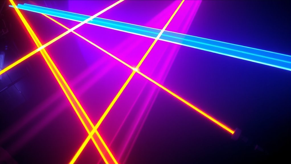
Understanding color theory is essential when working with neon lights and lasers, as it helps you create visually striking and harmonious displays. When you grasp how colors interact, you can craft vibrant compositions that catch the eye without risking overexposure or clipped highlights. One of the most effective tools at your disposal is color mixing. By understanding how primary colors combine, you can produce a broad spectrum of hues, allowing you to tailor your light displays precisely. For example, mixing red and blue produces magenta, while combining green and blue yields cyan. This knowledge enables you to create smooth progressions between colors, avoiding harsh contrasts that can cause highlights to clip or become overly bright.
Complementary colors play a vital role in achieving balanced and dynamic visuals. These are pairs of colors positioned opposite each other on the color wheel, such as red and green or blue and orange. When used together, complementary colors enhance each other’s vibrancy, making your neon or laser display pop without overwhelming the viewer. However, if you’re not careful, their high contrast can lead to clipped highlights, especially in high-intensity lighting. To prevent this, you should adjust the intensity and saturation levels of these colors. Lowering their brightness slightly allows you to use their complementary pairings effectively without risking overexposure.
Another key aspect of avoiding clipped highlights involves understanding how colors are perceived at different brightness levels. Bright, saturated colors tend to push the limits of your display’s dynamic range, increasing the chances of clipping. To mitigate this, consider balancing your color palette with softer or more muted tones, especially in areas where multiple colors converge. This prevents areas from becoming overly bright and losing detail. Additionally, controlling the power output of your neon lights or lasers ensures that no color reaches an intensity that surpasses your system’s capacity, helping maintain image integrity. Color matching techniques are also useful for achieving seamless transitions and avoiding abrupt contrast changes that can lead to clipping.
Lastly, always test your color combinations in real-world conditions before finalizing your design. Use a calibrated monitor or test environment to see how your colors blend and whether highlights clip. Fine-tuning your color mixing and adjusting the use of complementary colors based on these tests will give you better control over your display’s brightness and contrast. By applying principles of color theory thoughtfully, you can craft neon and laser visuals that are not only engaging but also well-balanced, avoiding the pitfalls of clipped highlights and ensuring your display remains vibrant and detailed.
Light Blox – LED Color Mixing Educational Kit for Grades 2-8 (Red Green Blue 3-Pack) – Transforms into Ray Box – Reflection and Refraction Optics Experiments for Kids
Learn How Light Bounces And Bends: Three colors of LED sources make narrow lines of light to explore…
As an affiliate, we earn on qualifying purchases.
As an affiliate, we earn on qualifying purchases.
Frequently Asked Questions
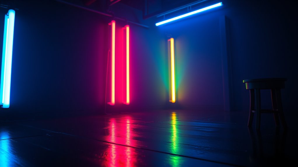
How Do Different Neon Colors Interact Visually?
Different neon colors interact visually through contrasting and harmonious relationships. Bright, contrasting hues like electric pink and lime create striking color contrast, making each color pop. Meanwhile, complementary neon shades, such as blue and orange, foster color harmony, offering a balanced, vibrant look. To avoid clipped highlights and guarantee clarity, use the right intensity and spacing, enhancing visual appeal while maintaining energetic, eye-catching effects.
What Are Common Mistakes in Laser Color Mixing?
You often make mistakes in laser color mixing when you ignore color contrast and disrupt palette harmony. For example, blending incompatible hues can create muddy or dull results, while overusing similar shades reduces visual interest. To prevent this, you should carefully select colors that complement each other, maintaining a balanced contrast. This ensures your laser display stays vibrant, harmonious, and visually engaging, enhancing overall impact without losing clarity.
How Can I Prevent Highlight Clipping in Digital Design?
To prevent highlight clipping in digital design, focus on highlight preservation and color balancing. Confirm your brightest areas aren’t overexposed by adjusting the exposure or highlights slider in your editing software. Use careful tonal adjustments to keep details intact, and avoid pushing colors too far beyond their limits. Regularly review your image on different screens, and utilize histograms to maintain proper luminance levels, ensuring your highlights stay vibrant without clipping.
Which Color Combinations Are Most Effective for Neon Signage?
Think of neon signage as a vibrant symphony where color combinations set the mood. To maximize impact, use contrasting hues like electric blue and hot pink, tapping into neon color psychology to evoke excitement. Pair these with laser safety colors—bright yellow or green—to create visibility and safety. These bold combinations grab attention and communicate energy, making your signage both eye-catching and effective while avoiding dull or muddy visuals.
How Does Ambient Lighting Affect Neon and Laser Color Perception?
Ambient lighting influences how you perceive neon and laser colors by blending the ambient glow with the surrounding hues. Bright ambient light can wash out vibrant neon hues, making them appear less intense, while dimmer settings enhance their luminosity. Surrounding hues also impact perception, as contrasting colors can make neon signs pop more vividly. To optimize visibility and color perception, control ambient lighting and consider the surrounding hues carefully.
LED color calibration tools
As an affiliate, we earn on qualifying purchases.
As an affiliate, we earn on qualifying purchases.
Conclusion
By understanding how neon and laser colors interact, you can avoid clipped highlights and create striking visuals. Remember, mastering color theory isn’t just about making things look good—it’s about ensuring your work communicates effectively. So, next time you’re designing with neon or lasers, ask yourself: are you balancing brightness and contrast to let your highlights shine without losing detail? With this knowledge, you’ll elevate your projects and captivate every viewer.

DJ Laser Light with App Control, 3D Animation Laser Projector for Party, Supports Custom Drawings, Text Playback, Personalized Programming, Sound Activated Laser Machine for Stage, Disco, KTV, Bar
Creative Control at Your Fingertips: Wirelessly connect to the mobile app to design custom 3D animations. Draw your…
As an affiliate, we earn on qualifying purchases.
As an affiliate, we earn on qualifying purchases.

Maxmoral 1pc DC 12V 24V LED Strip Dimmer Switch with DC Female Male Adapter Single Color Mini LED Lamp Lighting Accessories Brightness Adjustable Controller Manual Knob Dimmer Switch Black
Type: 1pc Black LED Dimmer Switch, be widely used in single color led lamp adjust brightness and switch…
As an affiliate, we earn on qualifying purchases.
As an affiliate, we earn on qualifying purchases.